TomTom Spark 3 - Continued

Design
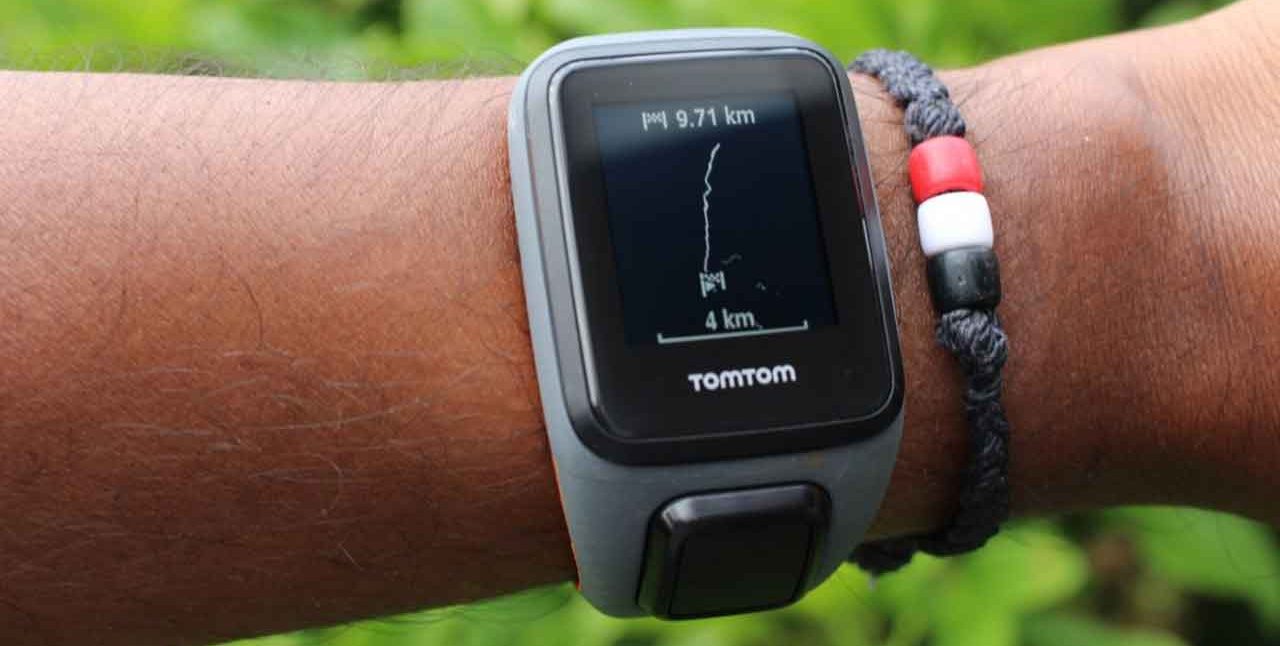
From the outside, all of the TomTom Spark 3 versions are identical. The watch is large and easy to read, and the attached plastic band is sturdy. I was used to wearing a Fitbit Flex and upgraded because I wanted a device with a watch; it comes in black with a black wrist band.
You can purchase additional bands in an assortment of colors. Each band costs less than $10. The overall design is functional.
Comfort and wearability
Even though the TomTom Spark 3 is lightweight, it took me a few days to get used to wearing it. It’s heavier than my Fitbit Flex. I briefly tried the sleep setting to monitor my sleep but wasn’t impressed with it because I didn’t like wearing it to bed. I lie on my side and found it to be uncomfortable. To be fair, I won’t wear a watch to bed or my Fitbit Flex either. I have friends who aren’t bothered by it.
Fashion
It looks more like a men’s watch in that the size is larger than a lot of women’s watches. The colorful wristbands you can buy for an additional fee make the watch look sporty as opposed to functional.
You can wear it to work or the gym. It’s not a dress-up kind of watch, but if you’re like me, I’d wear it to a formal affair and wouldn’t be bothered by it.
Apps, Email, IMs, and notifications
You can add MyFitnessPal and other apps to your Spark 3. If you have the upper-end version, you can download music.
The earlier versions of the Spark didn’t include emails, instant messages, or phone notifications. I had a tough time trying to download notifications to my Spark 3. When it didn’t work, I called tech support and found out TomTom recently updated this feature and wasn’t working. They did expect it to be up and running in December.
Social sharing
TomTom has a Facebook page, and members with their wearables can learn about new products, post questions, and get answers pretty quickly.
Updated:
December 14, 2017